Tatiana Szewczuk Photography
Enhanced web presence for both desktop and mobile


Project Type
Website for desktop and mobile
Role
UX/UI Designer
Tools
Figma, Zoom, Google Suite
Duration
5 months
The Challenge
As a freelance photographer, Tatiana usually posts and promotes her work on social media platforms like Instagram, Facebook, and X, but feels there are limitations on these platforms. She wants to be able to share her work and expand her client base.

The Solution
Creating a personal brand online helping increase client base by 30%

What information do competitors show on their website?
There were two main competitors to consider:
-
Freelance photographers
-
Photography studios
From looking at a multitude of websites, I recognized that all websites had the following common sections:
-
Home page
-
About page
-
Contact page
-
Portfolio/Works
Empathizing with current and future users
To understand how users go about booking a photographer, I recruited 2 groups of people; 2 of Tatiana's clients and 4 who have not booked with her before.
When recruiting interviewees, I wanted to recruit from different age ranges and life stages.
Tatiana's clients:


Not her clients:


User Interview Insights
Life milestones
People want to capture life events (engagement, graduation, etc.)
Research
-
Social media first then website if interested
-
They ask friends or family for recommendations
Difficulty
Lack of service's provided on social media
Identifying the target user
From the research, I formulated a target persona to understand who I'm designing for.

The Problem
Inexperienced clients need a way to see a photographer's services because they want their major life milestones captured.
Designing for the persona
All 6 participants mentioned they go through mobile first. I placed an emphasis on the mobile design first
The first iteration:
Mobile:


Works

About

Testimonials

Contact
Home
Web:

Home

Testimonials

Works

About

Contact
Going back to the drawing board
I realized immediately that the persona was not considered and Tatiana wanted a minimalistic design.
Updating the frames
Mobile:
For mobile specifically, the only change needed to be made was on the home screen as all the other screens remained the same.

I removed the other category images and instead focused on having a carousel that would show Tatiana's top pictures as well as give an option to see her photography services and method of contact.
Web:
.jpg)
Home
.jpg)
Testimonials
.jpg)
Works
.jpg)
About
.jpg)
Contact
Were users able to understand the overall website?
It was important to see if users were able to easily navigate the website.
The overall website was understandable. However,
.jpg)
1
2
1
4 out of 6 users thought "Book Now" and "Contact" meant different things.
2
3 out of 6 users clicked on the photography service icons first.
For mobile:

1
1
6 out of 6 users users would have liked everything to be seen at once without scrolling
All 6 users mentioned that they would like the background color to be lighter.
Building the website
Addressing the usability
With the feedback that I got from user testing and Tatiana, I made a few changes that addressed the user needs and Tatiana's preferences.

1
2
3
4
-
Button was changed to "Contact Me" to keep consistency
-
Icons are now clickable to other pages. Tatiana also mentioned she would like more services listed on her home page
-
The side bar navigation has more categories listed as well as the social media icons being listed below the logo
-
Overall background was changed to a lighter color
Additional changes:

From our meeting, we realized the Testimonials page looked very text heavy and wanted to make each individual testimonial stand out and easier to read.

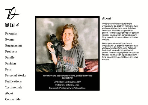
Tatiana mentioned her About page had too much white space. To fill up the page more, I included a background around her image and put additional contact information text.
Wix
Tatiana wanted her website built with Wix and gave me her account information allowing me to start building out her photography site.
As a website building platform, this restricted me as a designer since I was only able to design the website on Wix's website editor.

Finished Website & Next Steps
The website was published in March of 2024. Tatiana had mentioned in the future, she would like to add more categories as well as implement a shop feature to sell photocards. As of right now, there are no updates to be made, however, she would let me know if she needs me to make any adjustments in the future.


